Extent of Contamination
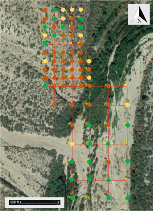
The extent of contamination is visually represented for the contaminants of concern for both human health risk and ecological risk.
Human Health Risk
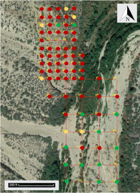
The figure below is the map of lead concentrations based off of the AZ Soil Remediation Standards for human health criteria. Red dots symbolize that the concentration was over the non-residential standard of 800 ppm, yellow dots symbolize that the concentration was over the residential standard of 400 ppm, and green dots symbolize that the concentration was below the residential standard.
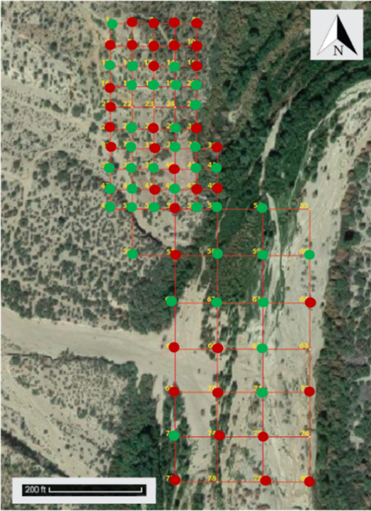
The figure below is the map of arsenic concentrations based off of the AZ Soil Remediation Standards for human health criteria. Red dots symbolize that the concentration was over the non-residential and residential standard of 10 ppm, and green dots symbolize that the concentration was below the residential standard.
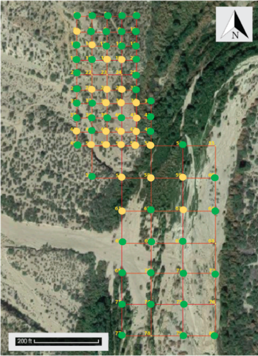
The figure below is the map of manganese concentrations based off of the AZ Soil Remediation Standards for human health criteria. Red dots symbolize that the concentration was over the non-residential standard of 3,200 ppm, yellow dots symbolize that the concentration was over the residential standard of 43,000 ppm, and green dots symbolize that the concentration was below the residential standard.
Ecological Risk
The figure below is the map of lead concentrations based off of the Ecological Standards for plants, mammals, and avian wildlife criteria. Red dots symbolize that the concentration was over the plant standard of 120 ppm, orange dots symbolize that the concentration was over the mammal standard of 56 ppm, yellow dots symbolize that the concentration was over the avian wildlife standard of 11 ppm, and green dots symbolize that the concentration was below all of the standards.

The figure below is the map of zinc concentrations based off of the Ecological Standards for plants, mammals, and avian wildlife criteria. Red dots symbolize that the concentration was over the plant standard of 160 ppm, orange dots symbolize that the concentration was over the mammal standard of 79 ppm, yellow dots symbolize that the concentration was over the avian wildlife standard of 46 ppm, and green dots symbolize that the concentration was below all of the standards.
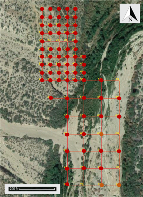
The figure below is the map of copper concentrations based off of the Ecological Standards for plants, mammals, and avian wildlife criteria. Red dots symbolize that the concentration was over the plant standard of 70 ppm, orange dots symbolize that the concentration was over the mammal standard of 49 ppm, yellow dots symbolize that the concentration was over the avian wildlife standard of 28 ppm, and green dots symbolize that the concentration was below all of the standards.
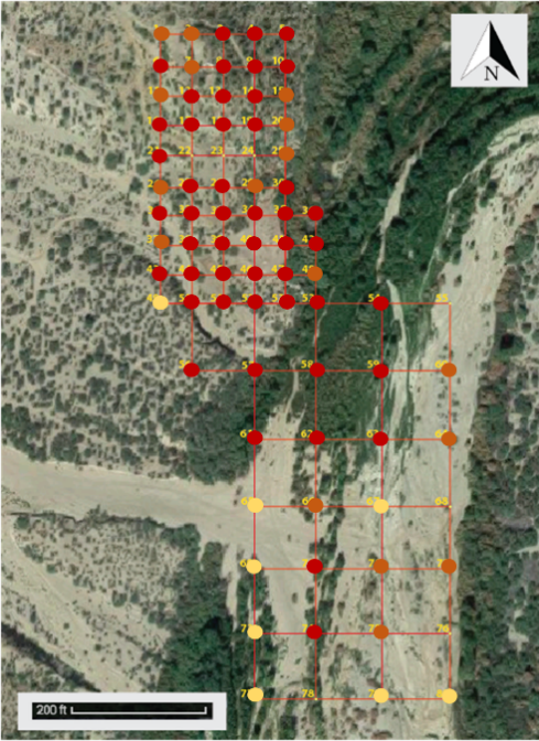
The figure below is the map of vanadium concentrations based off of the Ecological Standards for plants, mammals, and avian wildlife criteria. Red dots symbolize that the concentration was over the mammal standard of 280 ppm, orange dots symbolize that the concentration was over the avian wildlife standard of 7.8 ppm, and green dots symbolize that the concentration was below all of the standards. Vanadium did not have any standard levels for plants to compare the XRF data too in order to determine the risk to those biota.
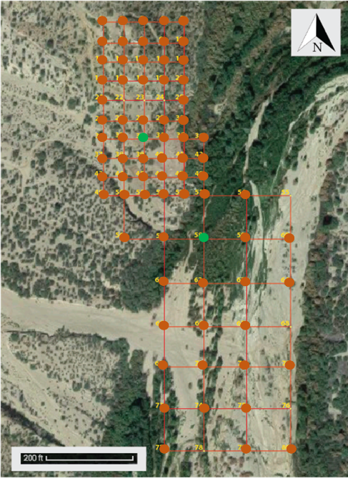
The figure below is the map of manganese concentrations based off of the Ecological Standards for plants, mammals, and avian wildlife criteria. Red dots symbolize that the concentration was over the avian wildlife standard of 4300 ppm, orange dots symbolize that the concentration was over the mammal standard of 4000 ppm, yellow dots symbolize that the concentration was over the plant standard of 220 ppm, and green dots symbolize that the concentration was below all of the standards.
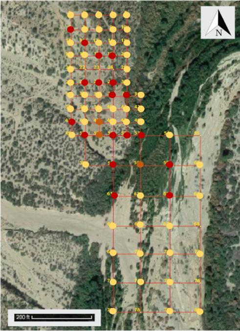
The figure below is the map of cadmium concentrations based off of the Ecological Standards for plants, mammals, and avian wildlife criteria. Red dots symbolize that the concentration was over the plant standard of 32 ppm, orange dots symbolize that the concentration was over the avian wildlife standard of 0.77 ppm, yellow dots symbolize that the concentration was over the mammal standard of 0.36 ppm, and green dots symbolize that the concentration was below all of the standards.
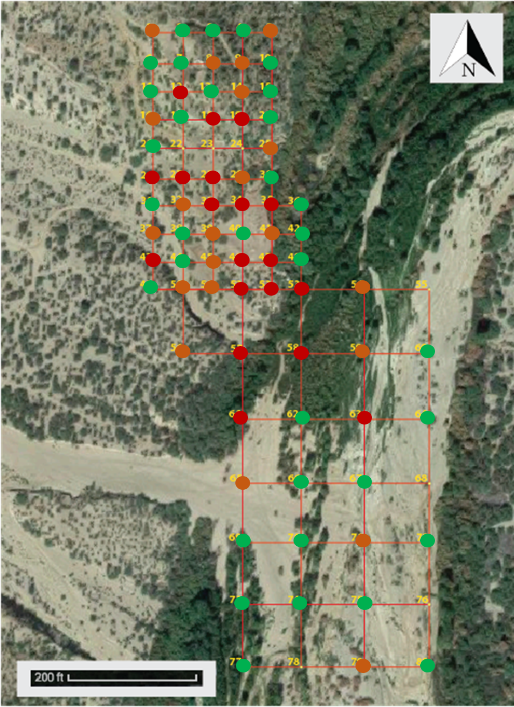
The figure below is the map of barium concentrations based off of the Ecological Standards for plants, mammals, and avian wildlife criteria. Red dots symbolize that the concentration was over the mammal standard of 2000 ppm and green dots symbolize that the concentration was below all of the standards. Barium did not have any standard levels for plants or avian wildlife to compare the XRF data too in order to determine the risk to those biota.
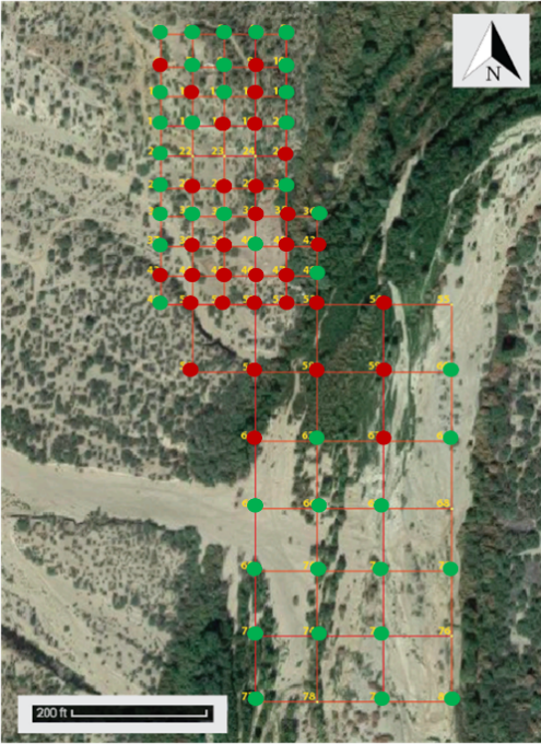
The figure below is the map of silver concentrations based off of the Ecological Standards for plants, mammals, and avian wildlife criteria. Red dots symbolize that the concentration was over the plant standard of 560 ppm, orange dots symbolize that the concentration was over the mammal standard of 14 ppm, yellow dots symbolize that the concentration was over the avian wildlife standard of 4.2 ppm, and green dots symbolize that the concentration was below all of the standards.
